

Opera Design As Mothballed Artifact
November 19, 2012
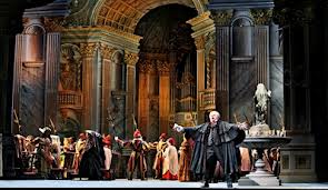
If only this Tosca could be as easy on the eyes as it is on the ears. I don't think I've ever been forced to stare at a set as ugly as this in a long time.
It's no surprise to discover that the design, by Thierry Bosquet -- a study in kitschy gilt and teetering colonnades -- is based on that of the company's original 1932 production.
But what on earth's the point of taking this approach, especially when the company clearly knows good design when it sees it, as recent productions of Bellini's The Capulets and the Montagues featuring Vincent Lemaire's dazzlingly simple yet visually captivating designs and Jake Heggie's Moby-Dick, which brilliantly merged 2D with 3D effects, clearly demonstrate?
Perhaps back in the 1930s, the sets had to be this opulent to give people something to look at. The singers in that era generally stood stiller than they do today.
But the "park and bark" stye of opera performance went out of style long ago. Performers move around the stage and actually engage in quite a bit of acting as well as singing these days.
But their efforts, no matter how vivid, end up being wasted in the case of this production, as the set is so busy and gaudy that any attempt at blocking is severely upstaged by the surroundings.
Opera is already considered to be a moribund art form by most people. Turning it into a museum piece, at least visually speaking, can't possibly help matters.
posted by Chloe Veltman at
3:55 PM
![]()
![]()
0 Comments:
Post a Comment
<< Home